Mistakes To Avoid When Displaying Errors On Forms
Learn to improve user experience and form submission success by avoiding common mistakes and implementing best practices for displaying error messages on forms.

Proper error handling in forms is crucial for a smooth user experience and ensuring the successful submission of data. In this blog post, we’ll discuss common mistakes to avoid when displaying errors on forms and provide best practices to ensure a user-friendly and effective error handling process.
Vague Error Messages
One of the most common mistakes is displaying unclear or generic error messages. Users need to understand the issue in order to fix it. Provide specific, informative, and actionable error messages that guide users towards resolving the problem.
Mistake to avoid:
- “An error occurred.”
Best practice:
- “Please enter a valid email address.”
Inappropriate Timing of Error Messages
Displaying error messages too early or too late can be frustrating for users. Avoid showing errors as soon as the user starts typing or after they’ve moved to another field. Instead, display errors after the user has finished entering data in the field or when they attempt to submit the form.
Poor Visibility and Placement of Error Messages
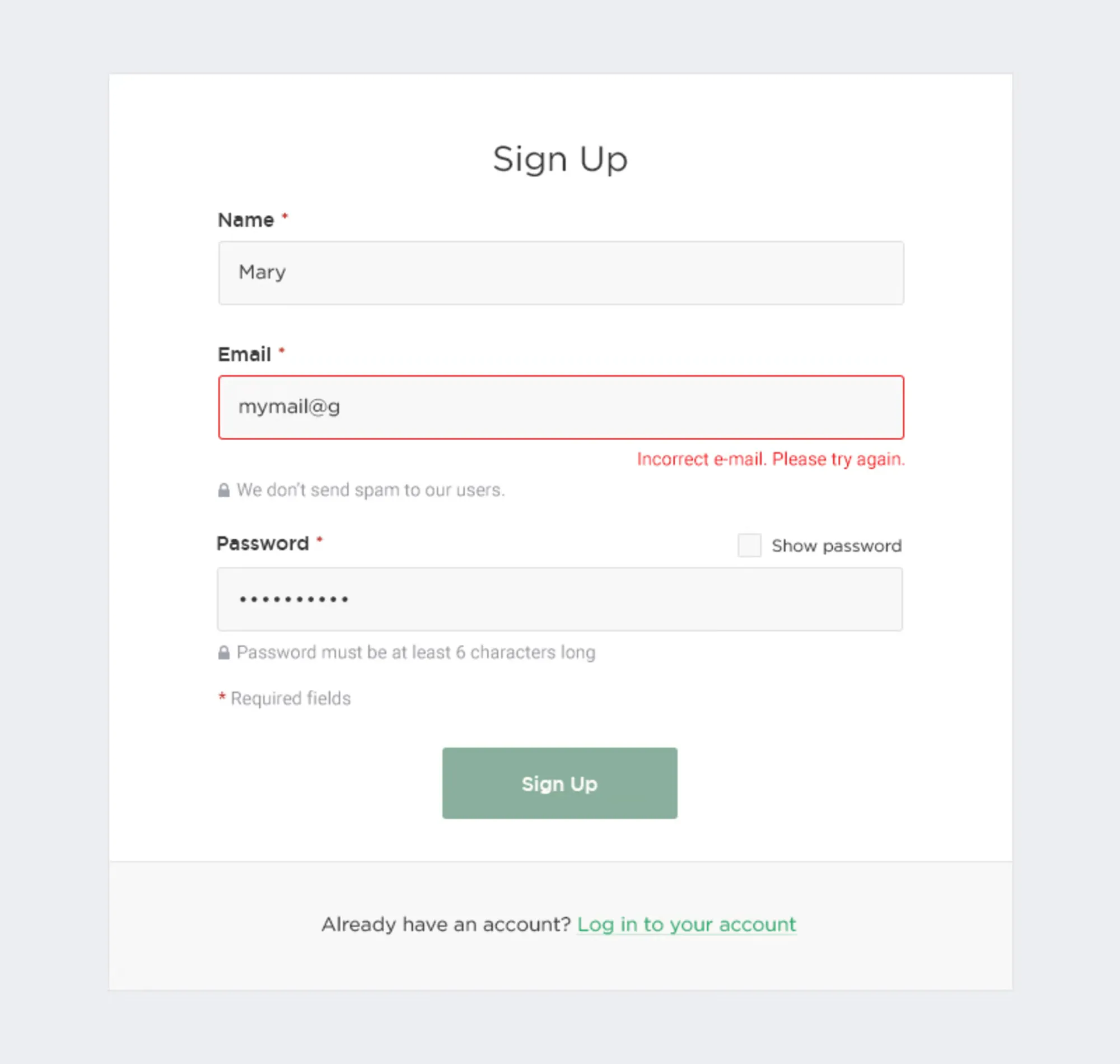
Ensure that error messages are easily visible and placed close to the affected input field. Avoid displaying errors at the top or bottom of the form, as users may not notice them. Use contrasting colors and appropriate sizing to make the error messages stand out.
Ignoring Accessibility
Remember to make error messages accessible to all users, including those with disabilities. Use appropriate markup, such as ARIA attributes, to ensure screen readers can interpret error messages. Additionally, don’t rely solely on color to communicate errors, as this can be problematic for users with color vision deficiencies.
Overloading Users with Multiple Errors
Presenting users with a long list of errors can be overwhelming and discouraging. Instead, consider displaying one error at a time, prioritizing the most critical issues first. Alternatively, group related errors together to make it easier for users to address multiple issues at once.
Failing to Retain User Input
A frustrating mistake is clearing user input when an error occurs. This forces users to re-enter data, which can be time-consuming and discouraging. Retain the user’s input when displaying errors, allowing them to correct the mistakes without starting over.
Not Providing Clear Guidance on How to Fix Errors

Help users resolve errors by offering clear guidance and examples. For instance, if a password doesn’t meet the required criteria, specify the requirements and provide a sample password that meets them.
Mistake to avoid:
- “Invalid password.”
Best practice:
- “Your password must be at least 8 characters long and include a combination of uppercase and lowercase letters, numbers, and symbols. Example: ‘P@ssw0rd!’”
Overlooking Error Prevention Techniques
Instead of solely relying on error messages, implement error prevention techniques to minimize the likelihood of errors occurring in the first place. This can include real-time input validation, auto-formatting, and tooltips that guide users on how to correctly fill out the form.
Conclusion:
Displaying errors on forms is an essential aspect of creating a positive and user-friendly experience. By avoiding common mistakes and implementing best practices, you can ensure that users can easily understand and resolve errors, leading to a more successful and efficient form submission process. Remember to prioritize clear communication, appropriate timing, accessibility, and error prevention techniques when handling errors in your forms. This attention to detail will improve the overall user experience and encourage users to engage with your website or application.